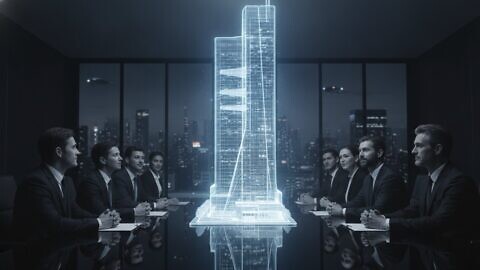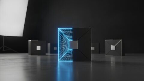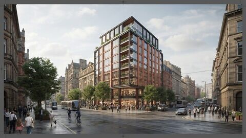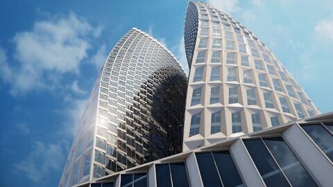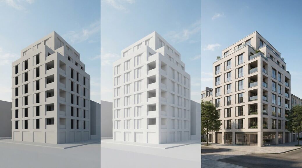
The right architectural rendering styles make a project easier to understand for the people assessing it. Clay and white-model views reduce visual distractions and clarify form and massing, while ambient occlusion reveals depth and spatial relationships. Photorealistic images communicate materials, lighting and atmosphere for presentations and marketing.
A highly realistic image can be persuasive, but it is not always the clearest choice for early design discussions. Whether you are testing a concept, resolving a planning question or presenting a developed proposal, choose a visual treatment that serves the purpose rather than competing with it.
This guide explains how clay, white-model, ambient-occlusion and photorealistic renderings support different project goals and audiences. You will see what each style brings forward, what it leaves in the background, and how to choose imagery with the right level of detail for each stage.
Key Takeaways
- Choose a visual treatment around the decision viewers need to make, not simply the level of realism you can achieve.
- Use clay and white-model views to make form and massing easier to assess without material or colour distractions.
- Ambient occlusion can help communicate depth and spatial relationships when a model needs more definition.
- Reserve photorealistic imagery for situations where materials, lighting and atmosphere help audiences understand a developed proposal.
- For marketing presentations that benefit from movement, architectural animation can extend the story beyond a still image.
Choosing a rendering style for project goals and audience
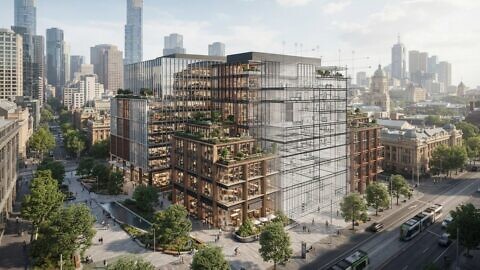
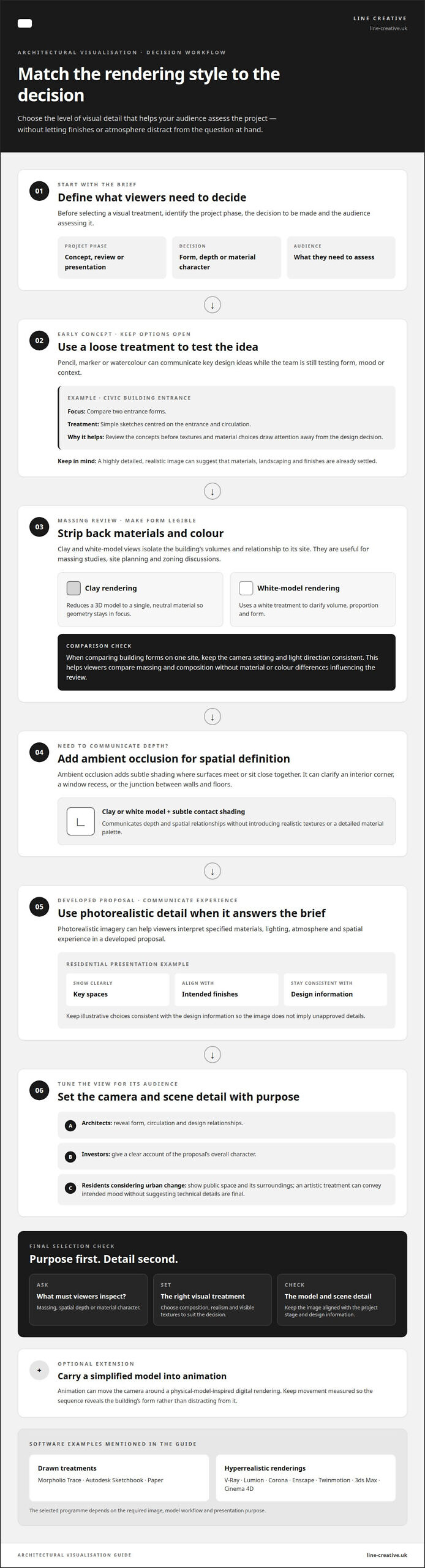
Which architectural rendering style works best for residential, commercial and urban projects? There is no single answer: match the image treatment to the decision and audience. Photorealistic images can communicate a residential interior’s materials and atmosphere, while simplified views clarify a commercial building’s massing. For urban proposals, an illustration can explain a public space without implying that its appearance is final.
Start with the project phase. During early concept work, pencil, marker or watercolour images can communicate key design ideas while leaving room for change. A detailed, realistic image may suggest that materials, landscaping and finishes are already settled. Choose a looser treatment while the team is still testing form, mood or context.
Situation: An architect is assessing two possible entrance forms for a civic building. Action: Present each option as a simple sketch, focusing the composition on the entrance and circulation. Result: Reviewers can compare the concepts before textures and material choices distract from the design decision.
As the design develops, choose a style that answers the next question. For a massing review, clay or white-model imagery isolates volumes and their relationship to the site. To discuss atmosphere, a watercolour rendering can suggest harmony and fluidity. For a final presentation, photorealistic detail can help viewers interpret specified materials, lighting and spatial experience.
Situation: A developer is presenting a residential scheme to prospective buyers. Action: Use realistic images of key spaces, with textures and lighting aligned to the intended finish. Result: Viewers can form a clearer impression of the proposed living environment. Keep the scene consistent with the design information so illustrative choices do not imply unapproved details.
The audience matters as much as the project phase. Architects may need images that reveal form, circulation and design relationships; investors may need a clear account of the proposal’s overall character. Residents considering an urban change may benefit from an illustration showing public space and its surroundings. Set the camera position and scene detail to suit what each audience needs to assess.
Situation: A public-space proposal needs to communicate its intended mood. Action: Use an artistic rendering to emphasise people, landscape and the character of the place. Result: The image foregrounds the proposed experience without suggesting that technical details are final.
Before choosing a visual treatment, define the decision, audience and design stage. Then select the composition, level of realism and visible textures that make those points clear. This sequence keeps each image purposeful, whether it supports concept development, stakeholder discussion or a public-facing presentation.
Clay, white-model, and ambient-occlusion rendering
Which software is commonly used for different architectural rendering styles? Sketching tools such as Morpholio Trace, Autodesk Sketchbook, and Paper support drawn treatments. V-Ray, Lumion, Corona, Enscape, Twinmotion, 3ds Max, and Cinema 4D are used for hyperrealistic renderings. The selected program depends on the required image, model workflow, and presentation purpose.
Clay rendering strips a 3D model back to a single, neutral material. White-model rendering uses a similar approach, presenting the building in white to clarify volume, proportion, and form. Both are useful for massing studies, site planning, and zoning discussions because colour and material choices don’t compete with the geometry.
Ambient occlusion adds subtle shading where surfaces meet or sit close together. It helps distinguish an interior corner, a window recess or the junction between walls and floors. Combined with a clay or white-model view, it conveys depth without introducing realistic textures or a detailed material palette.
Situation: A design team is comparing two building forms on one site. Action: Render both as white models, keeping the camera setting and light direction consistent. Result: Viewers can compare massing and composition without colour or material differences influencing the review.
Physical-model aesthetics can also guide a digital image. Material settings can imitate paper or wood, giving a 3D model the restrained character of a study model. This approach suits a concept presentation where the team wants to communicate form while leaving the final textures and finishes open.
For a CATIA modelling and digital-fabrication workflow, define the intended output before preparing the geometry. Align the model’s scale, component boundaries and level of detail with that output. Situation: A complex façade is under review. Action: Simplify the digital model into clear, separate elements. Result: The visual can communicate the façade’s arrangement without implying that every component is final.
Physical-model-inspired imagery is still a digital rendering, not a fabricated object. Animation can extend the same aesthetic by moving the camera around the model while retaining its simplified materials. Keep the movement measured so the sequence reveals the building’s form rather than distracting from it.
Choose the treatment by asking what the viewer must inspect: massing, spatial depth, or material character. For project-specific architectural rendering approaches, align the model detail and image style with that decision.
When choosing an approach, keep the image’s purpose in view: a neutral treatment works best when the review concerns form and placement rather than finishes. Clay and white-model architectural renders are used for massing studies, site planning and zoning discussions because they remove material and colour distractions. This keeps attention on the building’s shape and its relationship to the site, without asking viewers to assess a proposed palette.
Where a more tactile study-model impression is wanted, architectural 3D models can use material settings that imitate materials found in physical models, including paper and wood. That treatment can retain a restrained presentation while giving surfaces a model-like character. Choose between a neutral clay or white view and an imitated paper or wood finish according to whether the comparison calls for geometry alone or a hint of physical-model material.
Why Use Architectural Visualisations?
Architectural visualisation turns a design’s three-dimensional form into a two-dimensional image people can assess. It makes spatial relationships, exterior character, and design intent easier to discuss before construction. The roots of computer-generated architectural visualisation date to the 1960s, when digital graphics began developing alongside architectural modelling.
Early computer graphics used simple objects to test how geometry appeared on screen. Piet Hein invented the Soma Cube mechanical puzzle in 1933, and Gordon Romney rendered the puzzle at the University of Utah in 1968. Martin Newell created the Utah teapot as a computer graphics model. These experiments established ways to represent shape, surface, and light, principles still central to architectural images.
Photorealistic and stylised renderings have different purposes and visual languages. Photorealistic images use detail, materials and lighting to suggest a built environment; stylised images simplify or reinterpret those elements. Choose realism to explain a developed proposal, or illustration to communicate mood while keeping design possibilities open.
Two-dimensional and three-dimensional renderings also serve different needs. A 2D plan or elevation explains a single measured view, while a 3D rendering shows spatial form from a selected camera angle. Together, they can help a review audience connect dimensions with the building’s overall appearance.
Common illustration styles include watercolour, pencil or marker sketch, and collage. Watercolour can convey atmosphere and fluidity; sketching foregrounds lines and form, while collage combines a 3D scene with textures, objects, and figures. For example, an early public-space concept can use watercolour to suggest its intended mood without presenting every finish as final.
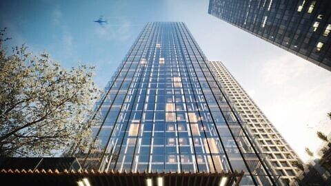
Lighting, materials and camera angle direct attention. A low-angle exterior view can emphasise height, while soft lighting can reduce hard shadows and reveal façade detail. Reflective materials draw the eye differently from matte surfaces. Choose each setting to support the image’s purpose rather than adding effects without a clear reason.
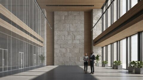
Hyperrealistic architectural visualisation adjusts lighting, texture, opacity and reflectivity to create a convincing scene. Situation: A presentation needs to communicate a proposed lobby. Action: Set the materials and lighting to show the floor, glazing and interior depth. Result: Viewers can interpret those design choices within a coherent image.
Current visualisation practice includes still imagery alongside animation and interactive viewing. A 360° computer-generated panorama lets viewers look in any direction from one position inside a building. For a walkthrough, movement can connect rooms and reveal circulation; a still image remains more controlled when one composition must carry the message.
Photorealistic rendering for final presentations and marketing
Photorealistic rendering is most effective when a presentation needs to communicate how a developed design may look and feel. It combines a three-dimensional model with material definition, lighting, camera placement, and environmental detail. Rendering software such as V-Ray, Corona, Lumion, Enscape, Twinmotion, 3ds Max, and Cinema 4D can support this process, with the choice shaped by the required image and production workflow.
Accuracy begins with the scene, not the final effects. Set the building geometry, material properties, light sources and camera before refining surface detail. Physically based techniques help materials respond consistently to light, while texture and reflectivity shape how viewers read glass, stone, timber or metal. Keep those choices aligned with the design information so the image communicates the proposal, not an unsupported alternative.
Situation: A developer is preparing a final presentation for a residential scheme. Action: The visualisation team aligns façade materials, interior finishes and daylight with the proposed design, then chooses a viewpoint that reveals the entrance and shared spaces. Result: The image gives stakeholders a coherent view of the project’s character and spatial relationships.
Photorealistic and hyperrealistic rendering are related, but they do not have identical aims. Photorealism seeks a believable representation of materials, light and space. Hyperrealism can push those qualities further through carefully adjusted lighting, texture, opacity and reflectivity. Use restraint: excessive gloss, dramatic shadows or unusually saturated colour can draw attention away from the architecture.
For marketing, a still render gives you control over composition and the focal point. An architectural film adds movement, allowing the camera to travel through rooms or past an exterior. Situation: A presentation must explain how visitors move from a public entrance into a lobby. Action: A measured walkthrough follows that route, using connected views and consistent lighting. Result: The sequence communicates circulation and spatial transitions more directly than an isolated image.
Choose the format according to what the audience needs to understand. A still image can focus attention on one defining view; a walkthrough can clarify connections between spaces. Before rendering, agree on the scene’s purpose, intended audience, camera path, material references and output format. This direction keeps the final presentation focused, coherent and useful for stakeholder discussions and marketing.
For a project that needs carefully composed CGI imagery, explore architectural 3D rendering shaped around its presentation goals.
3D rendering presents a structure’s measurements and detailed features from multiple angles, making it useful for sales and marketing presentations. A set of views can give audiences different ways to understand the proposal, while architectural walkthroughs and fly-throughs can use 3D animation to enhance the viewer experience. This makes it possible to pair focused images with a more continuous sense of movement through the design.
Photorealistic architectural rendering can require hours (sometimes days) of manual work, especially for texturing and lighting. Allowing time for these tasks supports the careful treatment of surfaces and illumination needed for a convincing presentation. Alex Roman’s short film The Third & The Seventh was described as having raised the bar for visualization 10 years earlier. A considered combination of stills and animation can help communicate a project’s appearance and the experience of moving through it.
Line Creative: CGI Animation
Line Creative can help you translate a chosen visual direction into architectural imagery and motion. Its CGI Animation, 3D Rendering, and Architectural visualisation support projects that need to communicate design intent to investors, stakeholders, or prospective buyers.
Choose 3D Rendering when a carefully composed still image needs to clarify a building’s materials, form, or setting. CGI Animation can extend that story through movement, helping viewers follow a route through an interior or understand how spaces connect. For product-focused projects, Product visualisation creates imagery centred on the item and its design.
Share the project stage, intended audience, reference material and the decision the visuals need to support. This context helps align image style and format with the communication goal. To discuss your project, contact Line Creative or visit line-creative.uk.
Set the visual direction for your next decision
Your next visual brief can do more than define an image. Set out what the audience needs to understand, which design details are settled and where the image will appear. This direction helps ensure your chosen architectural rendering styles serve a clear purpose, from concept review to stakeholder presentation or marketing.
Line Creative offers CGI Animation, 3D Rendering, and Architectural visualisation to support project communication through still imagery and motion. If you’re preparing a brief, identify the key audience, the intended use, and the aspects of the design that need to be communicated. These details give the visual team a clear basis for shaping the work around your project.
Contact Line Creative about your project to discuss the visual direction you need. A considered brief is a strong starting point for clear, purposeful project imagery.
Frequently Asked Questions
What are the main architectural rendering styles?
The main approaches include model-based, illustrative and photorealistic imagery, with clay, white-model, sketch, watercolour, collage and hyperrealistic treatments within those groups. For a useful brief, describe the intended visual character instead of relying on a style label alone. Attach reference images and mark the features you want carried across, such as line quality, contrast or material treatment. This gives the visual team clear, specific direction.
How to choose an architectural rendering style for a client presentation?
Prepare a reference pack before developing presentation visuals. Include the latest drawings, relevant material references, site context and a note distinguishing fixed design decisions from elements still under review. Mark illustrative additions that should not be read as confirmed design details. Gather comments in one consolidated feedback document, with each point tied to a particular view or element. This helps avoid conflicting directions during revisions.